Further tweaks
Codeculture.nl just got a bit better. The site was (and still is) in dire need of some tweaks to the interface. There were a couple of problems that needed addressing:
- I wasn't happy at all with the placement of the search box, it just took too much space and broke the flow of the first lines on the front page. Also I wanted to include the search box on every page and remove the search option from the main menu.
- The breadcrumbs looked dull and were hard to read on the striped background under the header.
- I started colour coding the pages with a simple rotator, so you get a fresh look if you refresh the page. However I didn't fully implement this. In the near future I'll probably dump the rotator and use the colour codes to brand specific pages.
- I found the main menu font colour to be a little too light. Click stats affirm this.
- There were some very serious cross browser issues (well, IE issues really, but let's be kind on microsoft for a change). There still are some problems especially with IE7, but at least the site functions properly on all major browsers.
- The project thumbnails on both the project gallery and the project nodes were inconsistent and badly delineated.
I fixed all of the above to at least some extent. More work will go into cross browser stuff, source code ordering, redoing the menus. Section branding the header image. And the engine will get some work to with integration to my wiki and my crm. to give my customers access to documentation, bug and update status, invoice history, etc.
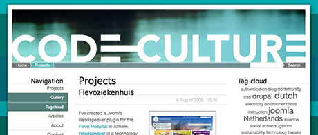
The page header before
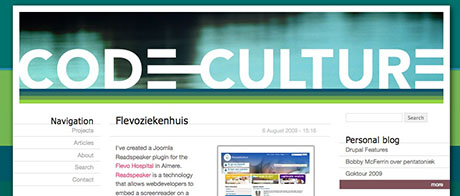
and after the tweaks